SaaS Dashboard Design
Complex data visualization made simple. Created an analytics dashboard that helps users make data-driven decisions quickly.

Overview
A comprehensive SaaS dashboard designed to help businesses visualize and analyze their data in real-time. The platform provides actionable insights through intuitive charts, tables, and customizable widgets.
Challenge
Users were overwhelmed by the amount of data and struggled to find actionable insights. The existing dashboard was cluttered and difficult to navigate.
Solution
We redesigned the information architecture, implemented progressive disclosure principles, and created customizable widgets. The new design featured clear data visualization, intuitive filtering, and personalized dashboards.
Design Process
User Research
Analyzed user behavior and identified pain points through analytics
Information Architecture
Restructured data hierarchy for better comprehension
Visual Design
Created a clean, modern interface with emphasis on data clarity
Component Library
Built a scalable design system for consistency
User Testing
Validated designs with target users and stakeholders
Launch & Monitor
Tracked metrics post-launch and iterated based on feedback
Results & Impact
60% improvement in user task completion
45% reduction in time to insights
90% user satisfaction score
Featured in Product Hunt top 10
Project Showcase


Related Projects
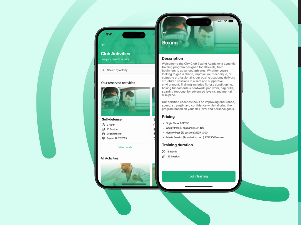
City Club Mobile Application
Complete digital transformation of club membership experience. Redesigned mobile app to solve UX issues and create a seamless platform for 50K+ members and families.

E-Commerce Mobile App
A seamless shopping experience with intuitive navigation and smooth checkout flow. Increased conversion rate by 35%.

Healthcare Web Platform
Patient-centered design for a telemedicine platform. Simplified appointment booking and doctor consultation.
Ready to see this project in action?
Explore the live project or check out my complete Figma portfolio to see the full design process.